|
|
|
|
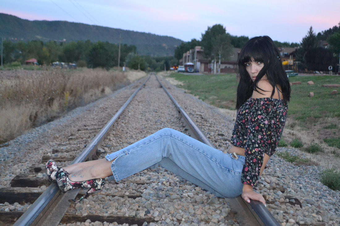
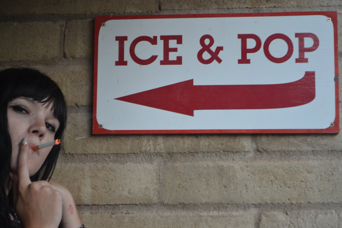
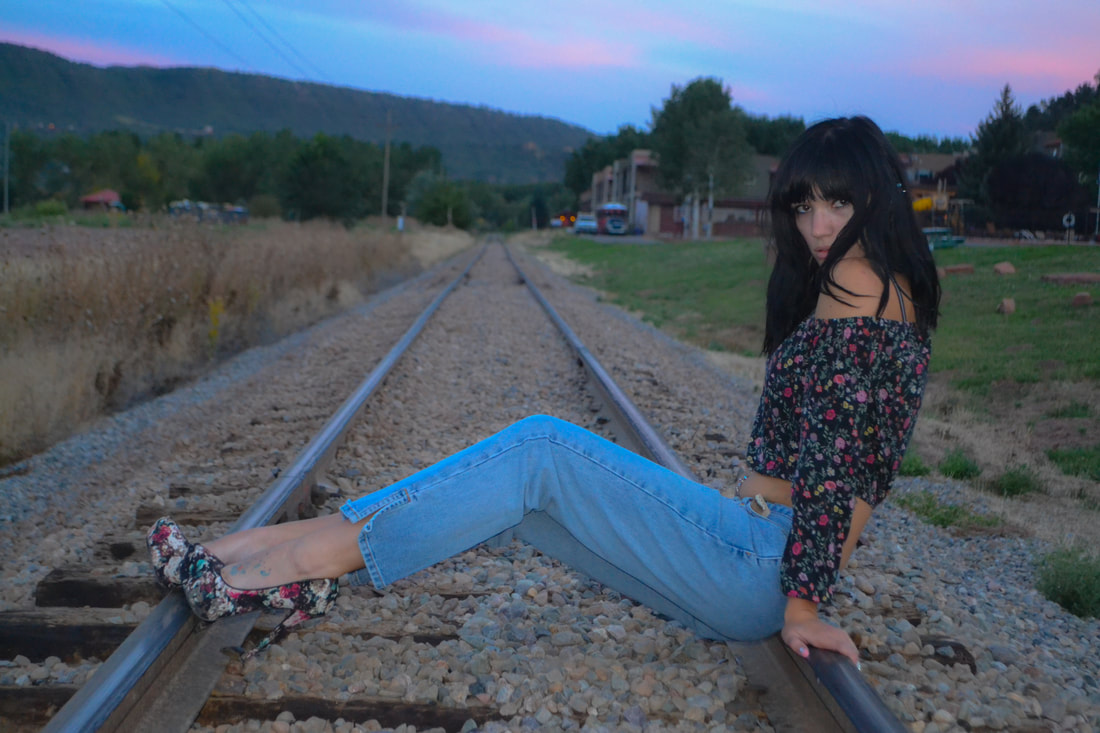
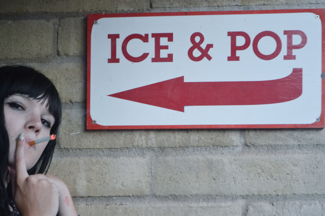
History- For the ICE POP photo I messed with the tinting to make the photo less red, I used color balance as well. I also used the histogram to make sure that I didn't have any spots of pure color. I also used the tonal curve to make the red brighter and also to brighten the wall. It also proved helpful when I was darkening her hair and the shadows. For the second photo, I used a pre-filter which made things more saturated, but also seemed to keep the photo looking natural with brighter lighting.
Opinion- I like both photoshop and lightroom. I don't think I would choose one over the other, but I enjoy how in lightroom I can concentrate on keeping my photo more "as is" rather than adding stuff and possibly making it surreal. But I also love having that option in photoshop to create something other than what was already in the photo. I think I will end up using them both equally, but if not, possibly lightroom.
Opinion- I like both photoshop and lightroom. I don't think I would choose one over the other, but I enjoy how in lightroom I can concentrate on keeping my photo more "as is" rather than adding stuff and possibly making it surreal. But I also love having that option in photoshop to create something other than what was already in the photo. I think I will end up using them both equally, but if not, possibly lightroom.
